The bathroom is often seen as a haven for relaxation and renewal, where every aspect of the design significantly influences the atmosphere. Among the various elements that shape this environment, the choice of hues stands out as particularly impactful. The right selection can elevate a simple space into either a tranquil, spa-like retreat or a vibrant, energizing area. This article explores the art and science of choosing the ideal color schemes for your bathroom, focusing on how to create a cohesive and appealing look.
The Role of Hues in Bathroom Ambiance
Hues profoundly affect our emotions and perceptions. In a bathroom, where we start and end our day, the selection of shades sets the tone for the entire experience. Whether you’re aiming for a soothing, serene environment or a lively, stimulating space, the color scheme you choose will be central to achieving the desired atmosphere.
Psychological Effects of Different Shades
Understanding the psychological impact of different hues can greatly assist in your design choices:
- White: Symbolizing purity and cleanliness, white is a timeless option. It creates a sense of space and light, making smaller bathrooms feel more open. However, an all-white space can sometimes seem too clinical, so it’s often paired with other hues or textures to add warmth.
- Blue: Renowned for its calming properties, blue is a favorite for creating a tranquil atmosphere. Lighter shades can make the room feel fresh and airy, while deeper blues add depth and sophistication.
- Green: Associated with nature and renewal, green imparts a refreshing vibe. It pairs well with natural materials like wood and stone, creating an organic feel. Softer greens foster a peaceful environment, while bolder tones can make a strong statement.
- Gray: A versatile and elegant choice, gray serves as an excellent backdrop, allowing other elements to stand out. It can be used in varying shades to create a monochromatic, minimalist look and evokes a sense of calm and relaxation.
- Black: Bold and dramatic, black introduces a sense of luxury and elegance. It creates a striking contrast with lighter hues or can be the centerpiece of a monochrome scheme. However, black can make smaller bathrooms feel more enclosed, so it’s best used in larger spaces or as an accent.
- Yellow: Bright and cheerful, yellow adds warmth and energy, making the space more inviting. It’s often used to inject a pop of color into more neutral schemes, though too much yellow can be overwhelming, so it’s usually balanced with softer tones.
Crafting a Cohesive Scheme
When selecting a scheme, it’s crucial to consider how the hues will work together to create a unified look. A well-planned palette can tie the space together and enhance the overall design, while a poorly chosen one can lead to a disjointed feel.
Starting with a Base Shade
The base shade is the foundation of your color scheme and will be the most prominent hue in the space. Neutral tones like white, gray, or beige are popular choices as they provide a versatile backdrop that pairs well with a wide range of accents.
For a more dramatic look, a darker base like charcoal or navy can add depth and sophistication. However, balancing a dark base with lighter accents is essential to prevent the space from feeling too confined.
Choosing Accent Hues
Accent hues complement the base and add visual interest. They can be applied to walls, cabinetry, tiles, or accessories, helping to break up the monotony of the base color. Consider the overall mood you want to create when selecting accents:
- Calming Palettes: For a serene, spa-like environment, opt for soft, muted accents like pale blues, greens, or lavenders. These work well with neutral bases and create a relaxing atmosphere.
- Bold and Vibrant Palettes: To make a statement, choose bold accents like teal, coral, or mustard. These hues add energy and personality, especially when set against a neutral or dark base.
- Monochromatic Palettes: For a minimalist, modern look, stick to varying shades of the same color. For instance, a gray base paired with lighter and darker grays creates a sleek, cohesive appearance.
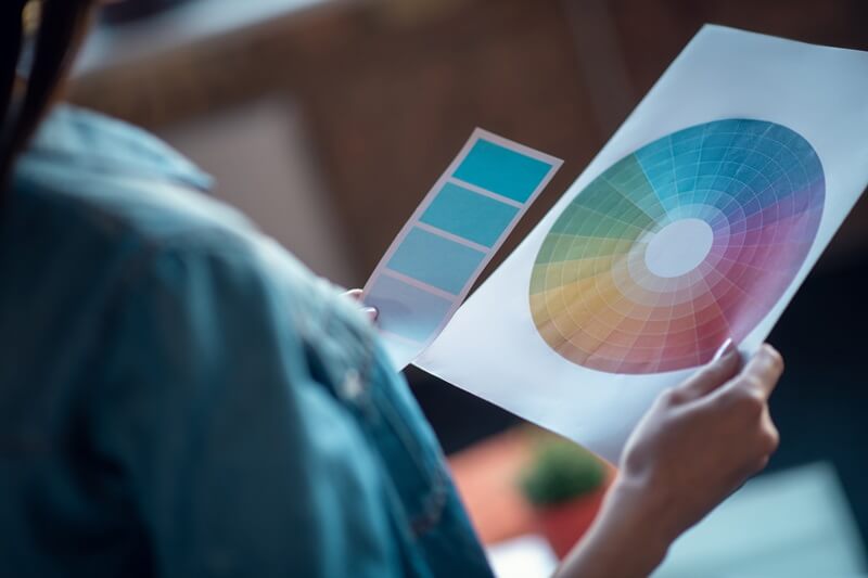
Utilizing the Color Wheel
It helps you understand how different hues relate to each other and how to craft complementary combinations. Several approaches can be taken:
- Analogous Colors: These are colors next to each other on the wheel, like blue and green or yellow and orange. Analogous schemes are harmonious and easy on the eyes, making them ideal for a relaxing space.
- Complementary Colors: These are opposite each other on the wheel, such as blue and orange or red and green. Complementary schemes create contrast and can add a dynamic, energetic feel.
- Triadic Colors: These are three colors evenly spaced around the wheel, like red, yellow, and blue. Triadic schemes are vibrant and balanced but can be tricky to execute in a small space. It’s often best to use one color as the dominant hue and the other two as accents.
Matching Schemes with Design Styles
Different styles lend themselves to specific color schemes. Aligning your palette with the style of your space can enhance the overall design and create a more cohesive look.
Traditional
Traditional design often features more muted and sophisticated schemes. Soft neutrals like cream, beige, and gray are common, paired with rich, deep accent hues like burgundy, navy, or forest green.
- Neutral Elegance: A palette of soft grays, whites, and beiges creates a timeless, elegant look. Accents in deep blues or greens add sophistication without overwhelming the space.
- Classic Monochrome: A black-and-white scheme is a hallmark of traditional design, creating striking contrast and can be softened with touches of gold or brass in the fixtures.
Modern
Modern design tends to favor monochromatic or neutral schemes with pops of bold hues. Gray, white, and black are popular bases, with accents like teal, mustard, or coral adding interest.
- Sleek and Minimalist: A palette of white, black, and gray creates a sleek, modern look. A single bold accent, such as teal or mustard, can be used sparingly to add interest without overwhelming the space.
- Warm Minimalism: For a more inviting modern space, consider a palette of warm neutrals like beige, taupe, and brown. Soft accents, like dusty rose or muted olive, add warmth while maintaining the minimalist aesthetic.
Rustic
Rustic spaces emphasize natural materials and a cozy, lived-in feel. Color schemes for rustic spaces often include earthy tones and warm neutrals, paired with natural wood and stone elements. Shades of brown, beige, green, and terracotta are common choices, creating a warm and inviting atmosphere.
- Nature-Inspired: A palette of earthy greens, browns, and tans creates a soothing, nature-inspired look. Natural wood and stone elements complement the scheme, adding texture and warmth.
- Warm and Cozy: A mix of warm neutrals, like beige and taupe, paired with terracotta accents creates a cozy, inviting space. This palette works well with natural wood elements and soft, plush textiles.
Contemporary
Contemporary design often incorporates more eclectic and experimental elements. Color schemes can vary widely, from neutral to bold combinations. The key is to create a balanced and harmonious look, even when using unconventional hues.
- Bold and Eclectic: A mix of unexpected hues, like bright yellow, deep teal, and soft pink, can create a vibrant, eclectic look. Balance bold hues with neutral elements to avoid overwhelming the space.
- Monochrome with a Twist: A monochromatic scheme in shades of gray or black can be elevated with a bold accent, like neon green or hot pink, creating a striking contrast and adding a contemporary edge.
Incorporating Tiles into Your Scheme
Tiles are a fundamental element in bathroom design and offer an opportunity to introduce both color and texture. When selecting tiles, consider how they will interact with the overall scheme.
Accent Tiles
Accent tiles can introduce a pop of color or pattern into a neutral bathroom. They can be applied as a backsplash, in the shower, or as a border. When choosing accent tiles, consider the color scheme of the bathroom:
- Subtle Accents: For a more understated look, choose accent tiles that complement the base hue of the space. For example, pale blue tiles can add a touch of color to a white bathroom without overwhelming the space.
- Bold Statements: If you want to make a statement, choose accent tiles in a contrasting hue or with a bold pattern. For instance, deep navy or emerald green tiles can add a dramatic flair to a neutral space. Bold patterned tiles, such as Moroccan or geometric designs, can become the focal point, adding visual interest and depth.
Tile Materials and Finishes
The material and finish of your tiles also play a crucial role in the overall look and feel of the bathroom. Different materials and finishes can influence the perception of hue, making them appear warmer, cooler, lighter, or darker.
- Glossy Tiles: Reflect more light, which can make colors appear brighter and the space feel larger. They’re an excellent choice for smaller bathrooms where you want to maximize light and create a sense of openness.
- Matte Tiles: Absorb light, making colors appear softer and more muted. They offer a more understated and sophisticated look, ideal for creating a serene and calming environment.
- Natural Stone: Materials like marble, granite, or travertine add a luxurious and timeless feel to the bathroom. These often feature natural variations in hue and pattern, adding texture and depth to the space. Stone tiles tend to be more earthy and neutral or glazed tiles. These surfaces are less likely to absorb moisture and stains, making them ideal for maintaining the cleanliness and appearance.
Durability and Longevity
Since bathrooms are high-traffic areas, it’s crucial to choose colors and materials that will stand the test of time. Trends in color schemes may come and go, but opting for timeless hues and durable materials can ensure your bathroom remains stylish and functional for years to come.
- Timeless Neutrals: Neutral colors, such as beige, gray, and white, are classic choices that won’t go out of style. These shades offer flexibility, allowing you to update the space with new accessories or accents without needing to overhaul the entire color scheme.
- High-Quality Materials: Invest in high-quality, durable materials that can withstand daily use and exposure to moisture. This includes choosing tiles, countertops, and fixtures that are not only aesthetically pleasing but also built to last.
Adapting to Changing Trends
While it’s important to select a color scheme that suits your personal taste and the style of your home, it’s also worth considering how your choices will align with future trends. If you enjoy keeping up with the latest design trends, consider incorporating trendy colors in small doses, such as through accessories, textiles, or easily replaceable items.
- Accent Colors and Accessories: One way to stay current with design trends is to use trendy colors in accents, such as towels, rugs, or wall art. This allows you to refresh the look without committing to a complete redesign.
- Versatile Palettes: Another approach is to choose a versatile color palette that can easily adapt to changing trends. For example, a neutral base color can be paired with a rotating selection of accent colors, allowing you to update the look as trends evolve.
Conclusion
Choosing the right color scheme for your bathroom is a blend of personal preference, design principles, and practical considerations. By understanding the psychological impact of colors, considering the style and layout of your space, and taking into account the durability and maintenance of materials, you can create a place that is both beautiful and functional.
Remember that is a personal space where you start and end your day, so the color scheme should reflect your style and contribute to the overall atmosphere you wish to create. Whether you prefer a calm and serene environment, a bold and vibrant space, or something in between, the right color scheme can transform your space into a place of comfort and rejuvenation.
If you’re ready to bring your bathroom design ideas to life, don’t hesitate to reach out to Millhawlk Design & Architecture. Our expert team specializes in creating personalized and functional spaces that reflect your unique style. Contact us today to request a quote for your project, and let us help you design the home of your dreams.